
This article was contributed by Lester Corey.
Are you looking to learn how to choose colors for logo design and understand the logo color meaning?

We explain color logo psychology in this extensive post, helping you understand how color works, the psychology of color, how to use color for differentiation, how to choose a logo color and how to create color palettes.
While various graphic elements are needed to be masterfully integrated together, color is by far, one of the essentials to convey your logo’s meaning.
Color is so powerful that it can influence thinking, reactions, and stimulate bodily hormones. It holds an array of meanings that manifest in the natural world, a ton of meanings that you can write papers about it, as well as in the diverse cultures around the world.
Color digs deeper in human psychology and because they play a vital role in influencing people’s interest, there emerges various color grading software that one could use to give their videos a professional look; thus designers can also benefit from harnessing and incorporating it in their designs. And with that said, here are some basic color meanings for you to understand and boost your proficiency as a logo designer:
Logo Design Colour Spectrum & Emotion Guide
Take a look at how popular brands use colour in their logo designs. Notice the heavy skews on blue and red?
Read on to learn how to choose the right color scheme for your logo design or brand by understanding the logo color meanings and the psychology behind them.
![]()
How to choose colors for logo design
Red’s Color Meaning in Logo Design
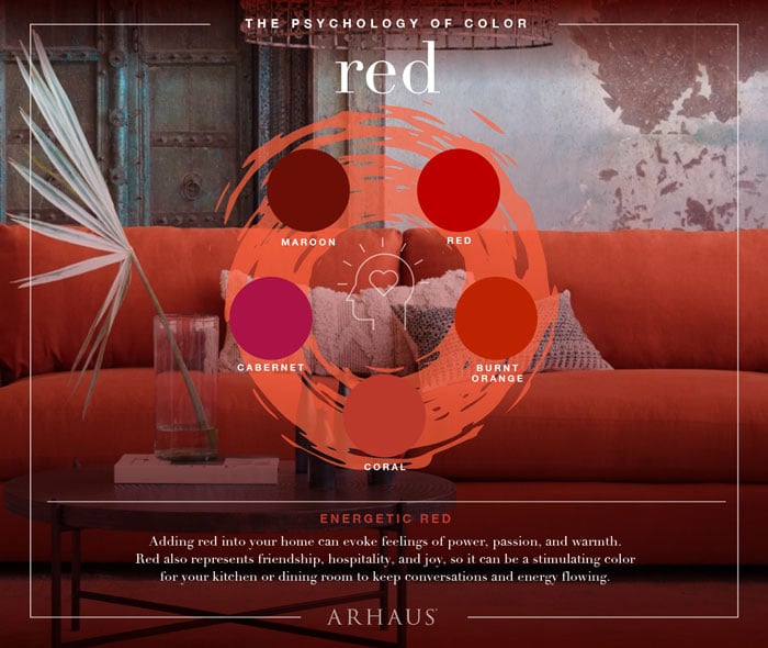
The warmest of all the color schemes, and the most popular among extroverts and males. It is as intense as fire and as warm as blood; red screams passion, energy, love, desire, and determination. That’s why many countries incorporate this color in their flags. As an effect in our human body, red enhances human metabolism, raises blood pressure, boosts appetite, and increases respiration rate. It is dynamic and definitely your go-to color if you want to get people’s attention – that’s why you can observe “buy now” or “click here” buttons all over the internet are colored as red.
Red is considered a global symbol of passion, anger, and excitement. It is a very famous color that can be used in branding. The color red is an attractive color that is used to design popular logos for the health, food, and entertainment industries. Many famous brands like Coca-Cola, KFG, and Red Bull have this color in their logo.
Yellow’s Color Meaning in Logo Design
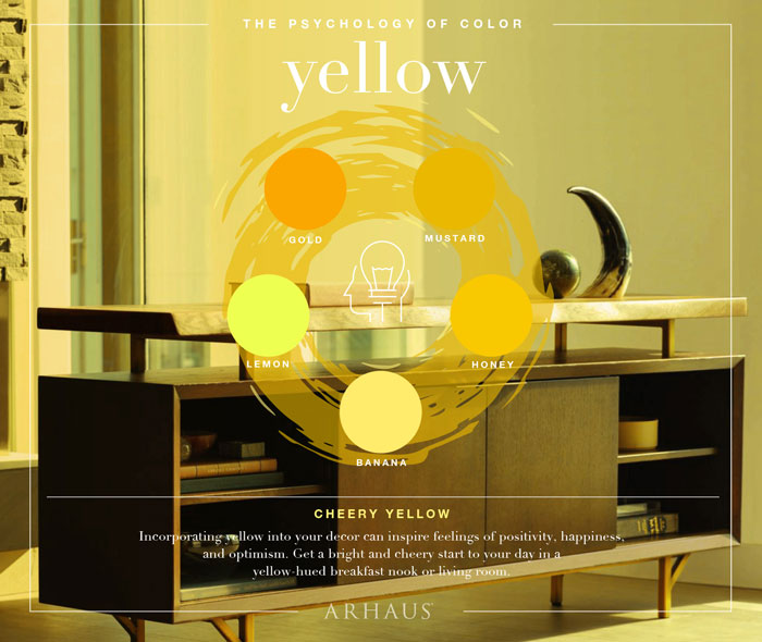
This vibrant color – often associated with sunshine – is all about the merriness in the world. It embraces people with warmth, boosts mental activity, makes us cheerful, and generates muscle growth. Use this color if you want to get attention like the color red, however, overusing it is not recommended. For instances, babies tend to cry in a room colored in yellow and it makes people distracted. Too much yellow makes people impatient, and too little yellow causes negative feelings of insecurity, fear, isolation, and low self-esteem, and many more. So, it is best to use color yellow in a balanced way in your logo designs.
Yellow has a very warm feeling associated with it. It invokes a sense of happiness, wealth, prosperity, and relaxation. But on the other end, it may also be associated with greed and toxicity.
It is a color that is commonly used in the automotive and food industries. Some popular brands that use yellow are DHL and Lays.
Blue’s Color Psychology in Logo Design
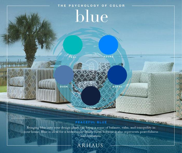
Blue can be used in logos for software, pharmaceuticals, governments, and banks. Blue, when used alone in a logo, can be very refreshing. If you’re looking to inspire confidence and knowledge though, consider pairing blue with red for your logo.
The color of the ocean and of the sky. A soothing color that caresses your heart with peace, freedom, intuition, imagination. It also inspires us to be loyal, to be sincere, to be confident, and to be intelligent – that’s why it is a highly corporate color. Blue definitely brings tranquility in the body since it slows down human metabolism. However, it can still be dynamic; for example, bright blue can bring a dramatic effect to your logo design while too much blue drags you down to melancholy, self-centeredness, or negativity.
Green’s Color Psychology in Logo Design
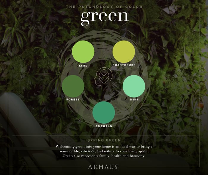
Green is used to represent environmentally friendly companies. It is mainly used by businesses that revolve around agriculture, gardening, and solar power. It gives a calming effect and at the same time represents growth. The color also symbolizes hope, serenity, and tranquility.
Nature’s favorite color – if nature does have a favorite color. Associated with the season of spring, it is a symbol of life, new beginnings, safety, fertility and environment; green is also a status symbol for money, banking, ambition, and wealth. Often times, the color green stands for lack of experience and continuous growth. Undeniably though, it has healing effects to us, both physically and emotionally, and is known to have a soothing effect to human vision. Since it takes dominance in the natural world, green takes a lot of space in the human eye’s spectrum. So, it is an ideal background for any kind of design because it is visible anywhere.
Purple’s Color Meaning in Logo Design

The perfect blend of the fiery attributes of red and the oceanic qualities of blue. It is a rare sight in nature; that’s why it is often regarded as sacred, delicate, and precious. Violet is a symbol of spirituality, passion, vitality, and higher self, as well as power, nobility, luxury, and ambition. Since it is a combination of red and blue, it retains its qualities. Incorporating it in your logo design shows elegance and glam; it has this luxurious effect that gives a sense of sophistication for those laying eyes on it.
Black’s Color Meaning in Logo Design
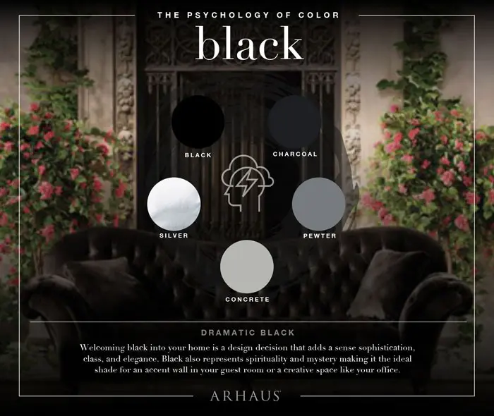
As mysterious as the shadows, black is the absence of colors. But it doesn’t give you absent feelings, rather, black shows strength, authority, sophistication, and elegance – even death, evil, and aggression. It is a corporate color: a prestigious one that is. It boosts confidence, and teases a lot of possibilities, as well as inducing feelings associated with emptiness. So, if you want to give your logo design an air of mystery and power, then you can count on black, just be sure with your logo design or it might come as something negative.
Brown’s Color Meaning in Logo Design
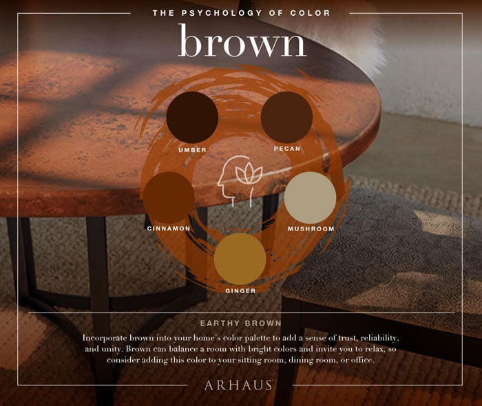
Brown can add a sense of trust, reliability and unity in to your design. It can balance a design and also make you relax. It also has earthy tones, which relates back to nature.
White’s Color Meaning in Branding

Associated with light, this color is a symbol of guidance, innocence, purity, beginnings, cleanliness, and so on. It represents coolness and simplicity; therefore, color white aids mental clarity, assists in cleanliness, and promotes thought and purifications. Using white in your logo design makes it look simple and clean, and since simplicity is the new trend with logo design today, you might want to consider incorporating this in your logo design.
Orange’s Color Meaning in Branding
The mixture of yellow and red – and also familiar to us as the sweet and sour fruit of the same name. Although, it is expected in this color to be a blend of red and yellow meanings, it stands out as a symbol of creativity and joy, and is often associated with autumn and harvest. It encourages emotional energies of compassion, warmth, and passion, happiness, and understanding; it is also the color for you to hold on if life bombards you with disappointments and heartbreaks. Studies have shown that orange stimulates hunger – reason why restaurants patronize this color so much – enhances a sense of activity, increases mental activity, boosts brain’s oxygen supply, and so on. Thus, it is highly visible in logo designs – like how red screams a look-over-here presence.
Color in Logo Design Summary
Keep in mind though that a color’s meaning varies in different countries and cultures; what meaning you may know about red is totally a different perception in different parts of the world. Also, different shades, tints, and hues change the color meaning in logos. So, it is best to be careful which color you would use in your logo design for your clients by understanding logo color meaning.
![]()
What your brand colours say about your business

—
Thank you to Arhaus‘ for the images above. Arhaus are experts in color and design advocate for expressive lighting. And thanks to Marketo for the above infographic.


Informative and innovative blog! By reading this blog Mr. Jacob, a new company can decide the name according to product and color perspective. Thanks for posting!
Really easy to understand, straight talking and inspiring! Thanks to you, I’m learning so much and applying it to my business. Thank you again! 🙂
Very helpful, thank you.
Simply explained to understand the importance of colours… very helpful for people who are trying to create a logo & brand identity for new businesses. Thanks!!!!
Really easy to understand 🙂 Thanks <3
Thank you ! I was juggling between colors – but was able to make my decision after reading your informative blog!