
In the recent years in the digital medium, the latest cutting-edge trends in web design has seen far more shifts and changes in technology and its use — as compared to the traditional print. Eighteen years into this new millennium there is no surprise that there it is still evolving posing a challenge to the web designers.
Web designers are facing a tough time in coping with the increasing technical challenges. These designers are creating sites that will meet the demands of the users. The demand of the hour is to make sites that are clear, user-friendly and informative. Currently a web designer has to also be innovative, adaptable to any device — and consistent with any corporate style.
The most significant shift was seen in 2017 when mobile usage eclipsed desktop browsing.
Mobile optimization significantly made a prominent platform to enable a better experience in visiting websites from the mobile. This paved the path of the industry to use and make the most this trend in 2018.
Designers are laser focused on mobile functionality and accessibility. Though desktops will continue to evolve and stay relevant — there are a few notable web design trends that are poised to take over this year.
Drop Shadows and Depth

The use of shadows has been a staple in web design industry. However, due to the advanced web browsers designers are making some exciting variations. Along with the parallax and grid layouts, the web designers are toying with shadows more than ever.
This has helped in creating a new depth and illusion beyond the screen. This trend has eliminated the flat design trend that was extensively followed in the past years.
With the help of the shadows web designers are now able to create a more versatile effect.
Shadows enhance the aesthetics of a website. The also improve the user experience with greater emphasis on details. The use of soft and subtle shadows gives a three dimensional effect.
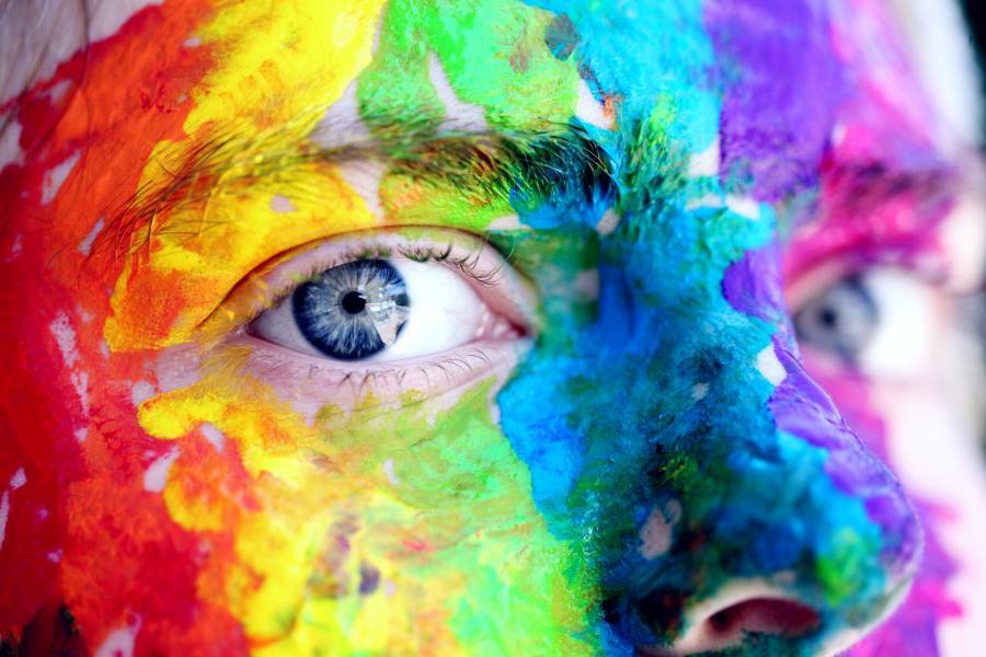
Vibrant and Saturated Color Schemes
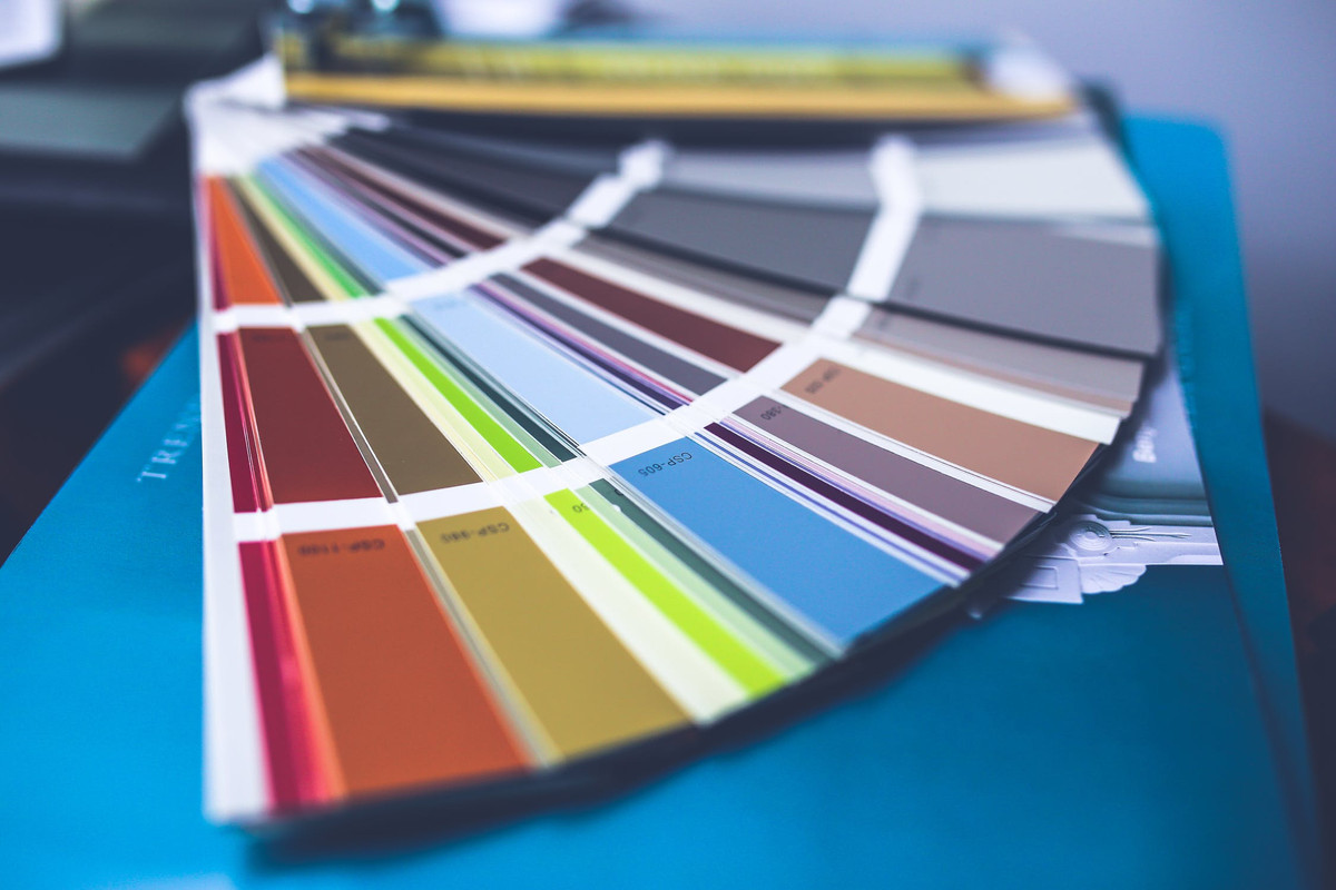
This year is definitely the year for use of colors in excess. In the past most of the designers as well as the brands played safe and used web-safe colors.
In the recent times the trend is to be more experimental and brave with the use of different colors.
Vibrant colors include vibrant shades and supersaturation. Use of headers that are no longer horizontal is also a brave approach followed nowadays. Designers such as Tayloright are using hard angles and slashes in their designs that have particularly aided by the technological advances.
Monitors and other device screens that can produce richer colors can attract the attention of the visitor with these vibrant and clashing colors.
Particle Backgrounds Solution
Particle background is an effective and useful solution.
These particles add to any performance issue with the website having a video background. The web designers use lightweight animations in javascript. This allows movement that is created as a normal part of the background. This does not affect the loading time either.
Since it is a well-known fact that an image speaks more than a thousand words. Using a moving image certainly speaks more than a few thousand words. Likewise, the particle backgrounds instantly attract the attention of the users that helps the brands to create a more memorable and instant impression.
Motion graphics are becoming more and more popular to users especially on the social media as it provides an eye-popping leadback to its landing page.
Mobile Browsing First

Mobile browsing is predominant. Browsing and shopping is ever increasing as almost everyone shops on their smartphone these days. In the past, this was not possible as designers didn’t have a decent sub-menu or even a menu for a small screen. Over time, mobile web design has matured and the menu has been minimized for a smaller screen.
Images and photos are cropped to fit in the mobile version.
The use of icons is much more now which is also economical in terms of space. The users do not have any trouble understanding these changes and the UX issues are resolved in better ways. Identifying the fix with micro-interactions has helped in getting instant feedback of the actions of the users.
Using Custom Illustrations
Use of illustrations are more now as it is a great and most versatile way to create a playful website that is friendly. Adding an element of fun to the site the experienced web artists can make illustrations full of personality. These tailored images and illustrations are in exact tone of the brand and helps to get more crowd. Illustrations strategically designed and used make the brand as well as the site more approachable to the customers.
Use of Bold Typography
Typography is a powerful visual tool in web design. It enables the designer to give personality to the site and at the same time evoke emotion. It sets the right tone on the website and at the same time convey the important information successfully.
With the latest technological development device resolutions are sharper and easier to read and that has facilitated the use of more custom fonts. There are several browsers that can even support any hand-made typefaces with the CSS feature.
Large letters, contrasting sans serif and serif headings are in vogue now that helps the designer to create dynamic parallels.
It also improves UX and the most significant aspect is that it keeps the visitors engaged with the content of your website. Especially for the web pages the headers are the key SEO elements. This help in scanning the eyes of readers by ordering the required information.
Looking ahead beyond 2018, the designers are taking full advantage of this using creative typefaces.
Use of Dynamic Gradients
Last few years saw flat design as the much preferred trend in web design but gradients have made a comeback in 2018.
In the past years gradients were primarily used to provide subtle shading to the element to give it a 3D effect. But now, gradients are used in big, full and loud in color. This has made ordinary image look stunning and provide a perfect background if you do not have any image.


