
Looking for the best fonts for subtitles & captions? Whether it be for YouTube, Premiere Pro, or another video editing tool, here are our top picks!
Creating closed captions is crucial today and this guide from BBC does a swell job in teaching video enthusiasts how to add captions to videos!

From being a purveyor of accurate information to giving valuable interpretations, adding subtitles to video content is turning out to be increasingly normal.
However, choosing the best font for your captions and subtitles can be challenging in terms of accessibility and branding due to the abundance of style options available.
This is where we come in! Our goal for the list below is to help you select a closed captioning textual style that’ll easily help you become a better storyteller.
The Best Fonts for Subtitles & Closed Captions
- Lucida Grande — Most legible
- Times New Roman — Best serif
- Futura® — A modern classic
- Arial (or Helvetica) — Neutral & clean
- Open Sans — Legible with great character support
- Verdana — Best for small text
- Roboto — Bold and clear
- Proxima Nova — Modern & professional
- Lato — Clean and crisp
- Consolas — Best monospace (equal spaced)
Fresh Fonts for Captions & Subtitles
FRESH FONTS FOR CAPTIONS – UNLIMITED DOWNLOADS: 50 Million+ Fonts & Design Assets
![]()
Looking for some fresh closed caption font alternatives? Download all the closed caption fonts you need and many other design elements, available for a monthly subscription by subscribing to Envato Elements. The subscription costs $16.50 per month and gives you unlimited access to a massive and growing library of over 50 million items that can be downloaded as often as you need (stock effect & element packs too)!
The Best Subtitle Fonts for Closed Captions & Video Editing
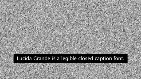
1. Lucida Grande
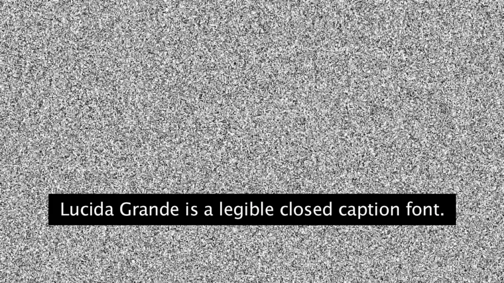
Looking for a versatile and legible font that works in any screen display size? Look no further than Lucida Grande!
We’ve observed that this humanist sans serif font has a large x-height, clear letterforms, and space-saving economy that make it easy to read even at small sizes. We love its legibility and extensive range of type styles making it a perfect subtitle font.
Even Adobe Premiere Pro (get a 65% discount here) uses Lucida Grande as its default subtitle font.
With eight fonts in the Lucida Grande family, ranging from Thin to Black with matching italics, there’s a style for every need.
We highly recommend Lucida Grande to anyone looking for a reliable and versatile font for your subtitles and caption needs!
2. Times New Roman
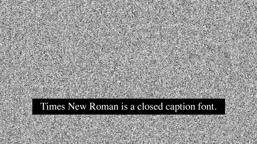
We were skeptical at first, but we have to admit—Times New Roman has won us over as a top font choice for subtitles and captions!
It may seem like a classic choice, but that’s because it’s tried and true. With its clear letterforms and easy readability, we’re confident that it’s a great choice for both printing and screen displays.
Plus, with its extensive range of type styles and support for multiple languages, Times New Roman is a versatile and accessible option for a wide range of subtitles and caption projects.
If you are a fan of this font, you can see more Times New Roman alternatives here.
3. Futura®
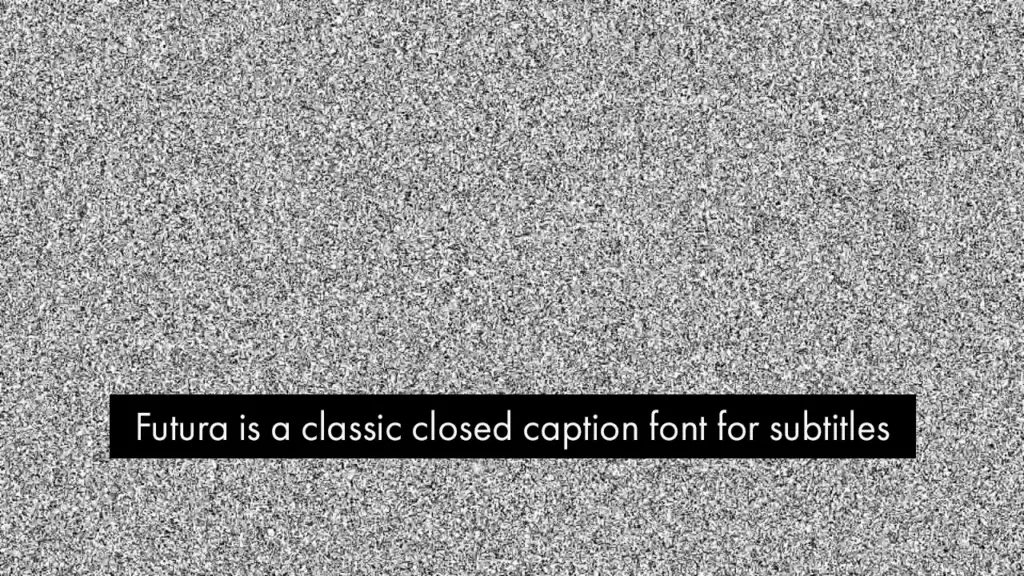
If you’re looking for a font that is both clean and bold for your subtitles and captions, Futura might be just what you need!
This font’s geometric design makes it easy to read even at small sizes, and its boldness ensures that it stands out on any screen.
One of the best things we love about Futura is its consistency in letterforms and spacing.
In our opinion, this guarantees that your text will always be legible and clear, no matter where you use it.
With a range of weights and styles to choose from, you’ll have plenty of flexibility to create contrast and hierarchy in your subtitles and captions.
So, if you want a font that is both versatile and eye-catching, we highly recommend giving Futura a go.
4. Arial or Helvetica
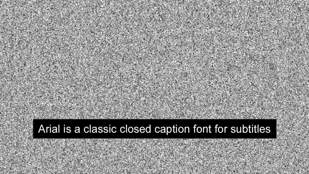
We know, Arial is another well-loved timeless font. But of course, we can all agree that its clean and straightforward sans-serif design offers excellent legibility for subtitles and captions.
Its simple, no-frills design makes it easy to read even at small sizes, and it looks great on whatever screen size.
We also considered how its uniform letter shapes and spacing ensures consistency and clarity across different platforms and applications.
Trust us, this classic font is a reliable choice for anyone looking for a font that is easy to read and versatile enough to use in various contexts.
Whether you’re watching an action movie or a true crime documentary, this one’s sure to deliver.
Some may go for Helvetica instead but either of them is just as good an option.
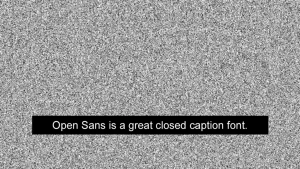
5. Open Sans

Open Sans is a modern sans-serif font that is commonly used in video subtitles and captions, because it’s legible and easy to read, even at smaller font sizes.
While it isn’t our immediate first pick, its simple design and clear lettering make it an excellent choice for professional video content aiming for a modern humanist touch.
Released in the mid-2000s, this straightforward open-source font was commissioned by Google and designed by typeface designer Steve Matteson.
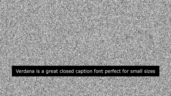
6. Verdana
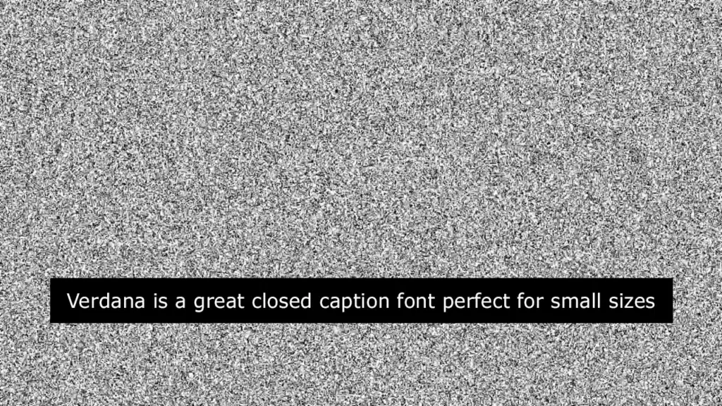
Verdana is a popular font for subtitles and captions because it is easy to read at small sizes. Its letters are well spaced out, allowing it to be easily read even at a distance.
We also like how evenly sized the characters are, making it yet another stellar choice for closed captions and subtitles.
Originally produced for Microsoft, this beautiful humanist sans-serif typeface is perfect for headlines and long chunks of paragraphs, and of course, closed captions.
7. Roboto
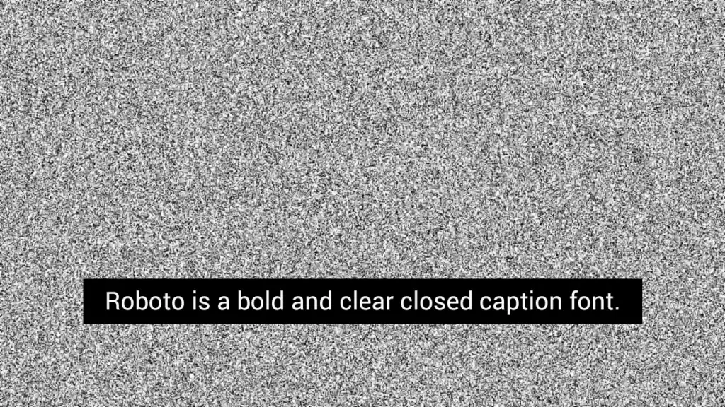
Roboto is a sans-serif font that is commonly used in subtitles and captions and its bold and clear letters make it legible, even at smaller sizes. Roboto’s simplistic design also helps to make the subtitles look clean and professional.
Fun fact: The Google-developed neo-grotesque sans-serif typeface family Roboto was released in 2011 for Android 4.0 “Ice Cream Sandwich,” making it the default font for Android.
So, if this textual aesthetic feels incredibly familiar, it’s probably because it’s the font you used to see on your screen.
All things considered, we’re huge fans of Roboto, and it being a top choice for closed captions makes perfect sense!
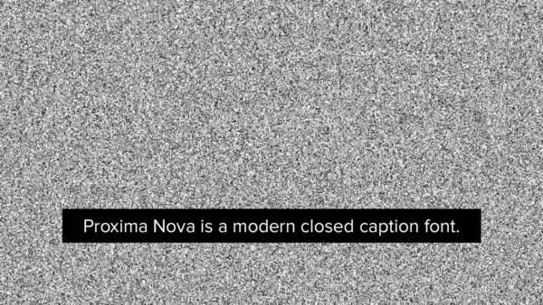
8. Proxima Nova
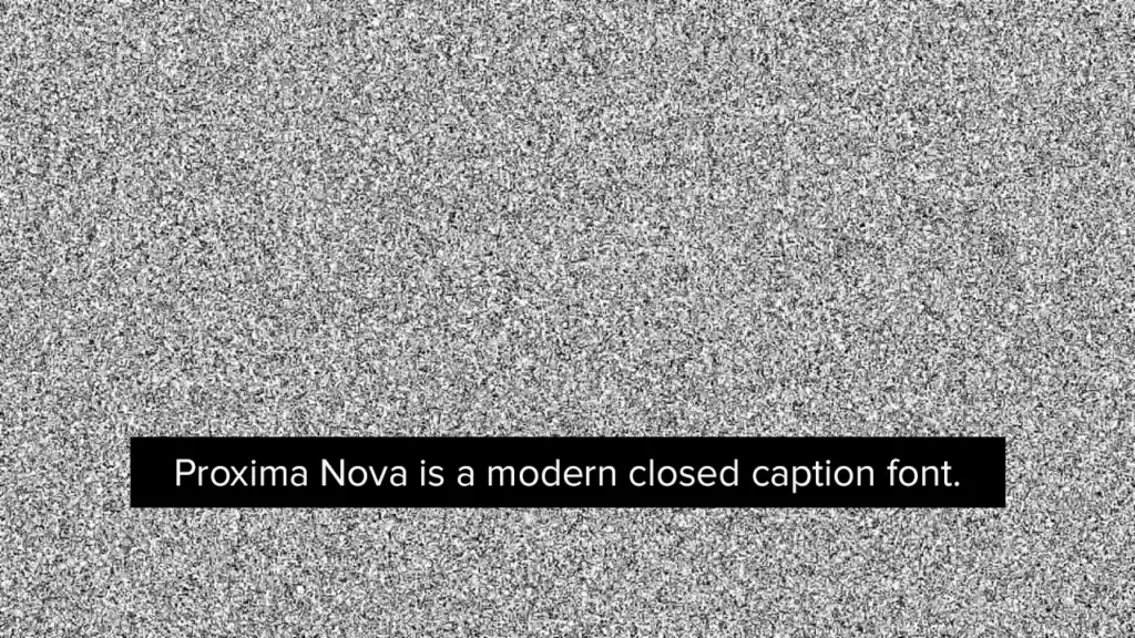
Unlike many fonts here, Proxima Nova was more than two decades in the making, receiving a ton of iterations before it became the popular font it is now.
An earlier version of the font was released in 1994, with the updated version making its way to computer screens in 2005.
All in all, it’s is a popular font that’s used in subtitles and captions and is perfect for modern designs where you need closed captions to appear modern and professional.
Each character sports a tasteful curve among its edges, giving it a classy look overall.
9. Lato

Lato is a sans-serif font that is professional and easy to read because of its clean design and clear lettering.
This makes it perfect for subtitles and captions. Lato’s letters are well-spaced out, making it easy to read even at font sizes that are smaller.
In the early parts of 2010, Warsaw-based designer Łukasz Dziedzic introduced the sans serif typeface family Lato (which, by the way, means “Summer” in Polish).
Towards the end of that very year, the Lato family was distributed under the Open Font License by his foundry tyPoland, with help from Google.
It may not be as big or popular as Roboto, Verdana, or Helvetica, but dare we say it’s just as effective, sharp, and functional!
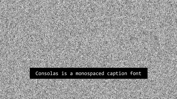
10. Consolas

Netflix uses Consolas as their primary subtitle font.
It’s a monospace, fixed-equal spaced font that is highly legible at all sizes and because all characters have the same width, like old typewriters, it is a good choice for subtitles because line lengths are easily measured since they do not change.
The proportions of this monospace font are closer to normal text than traditional monospaced fonts like Courier which allows for a more comfortable reading experience, especially on screen and for longer paragraphs.
5+ Fresh Subtitle Fonts for Closed Captions
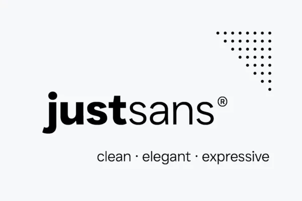
1. JUST Sans® Clean Modern Minimal Geometric Typeface (Free)
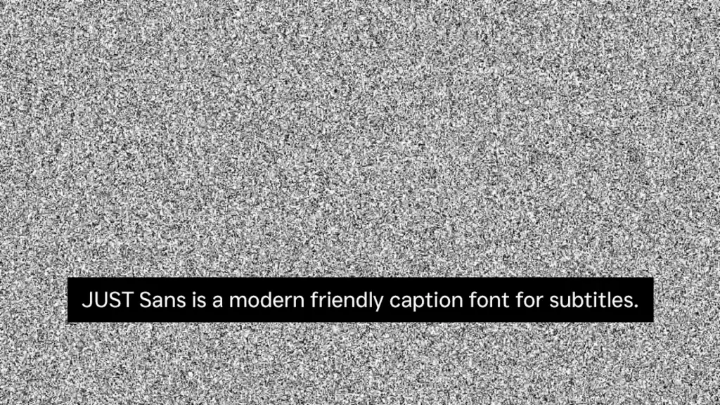
This versatile font combines a modern geometric sans serif style with a touch of warmth and friendliness, making it easy on the eyes and easy to read.
We particularly love its sharp angled terminals and open-airy characters that give it a contemporary feel and make it so expressive.
What’s even better is that JUST Sans is designed to be functional for a range of uses, including on screens.
Its minimal aesthetic ensures clear legibility, even on small screens, and it comes in seven weights with complete Latin extended language support.
This means that we can use JUST Sans for a wide variety of screen sizes.
But what we love most about it is its unique blend of modernity and warmth, along with its functional design, making it a standout caption font that’s both versatile and reliable.
Download two free weights here.
2. Albori Sans-Serif

Rather than use the standard Arial or Helvetica, this contemporary and versatile typeface, complete with smooth curves and round corners, gives your captions a fresh and modern feel.
We appreciate the font’s unique personality, achieved through its consistent style across the entire family.
Albori works seamlessly for both display and text use, making it perfect for a variety of screen sizes.
The font’s extensive language support, including Latin, Extended Latin, and Cyrillic, means that we can use it for a diverse range of projects.
3. MADE TOMMY
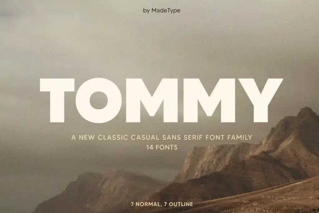
If you’re looking for a font that is both classic and casual for your subtitles and captions, MADE TOMMY is our next recommendation and a great Futura alternative.
With 14 styles to choose from, you’ll have plenty of options to find the perfect fit for your project. What we think is its best feature is its simplicity and clarity that makes it easy to read even in small sizes.
This ensures that your audience won’t miss a beat.
We also love that MADE TOMMY is versatile and can be used in a variety of settings, from films and TV shows to YouTube videos and social media posts.
4. Gilmer – Geometric Sans Serif
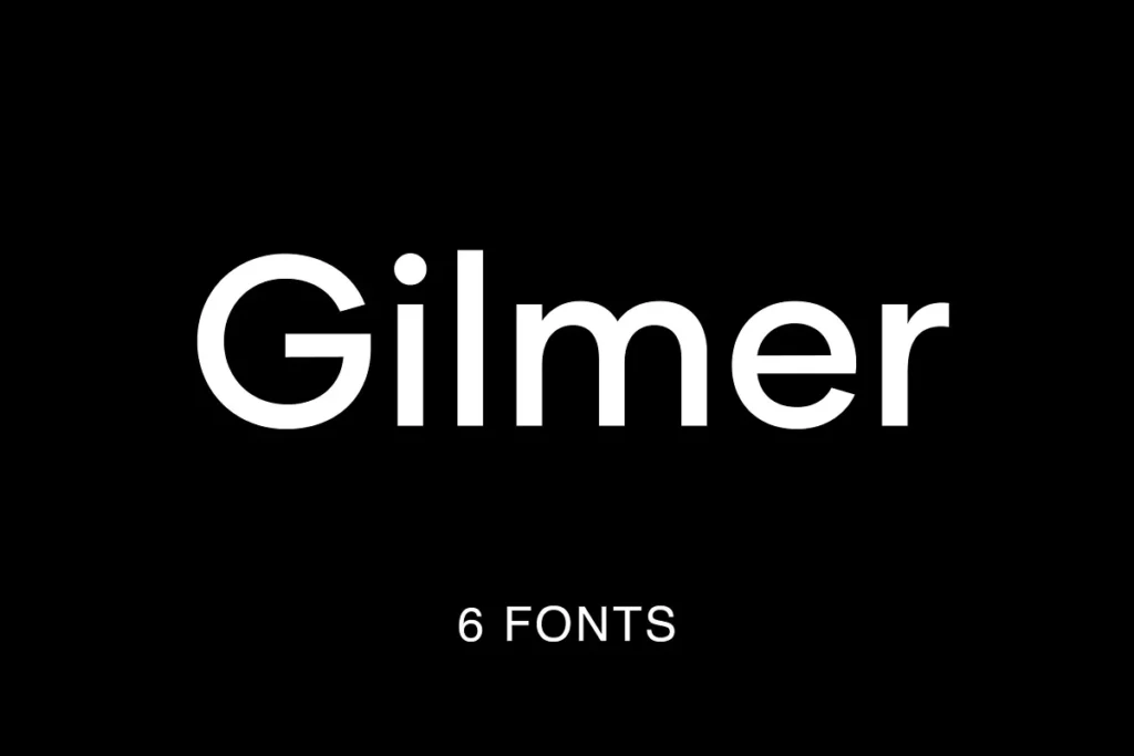
Are you looking for a font that can keep up with your modern and sleek design needs? We recommend Gilmer.
With its fresh, geometric, and versatile design, it’s perfect for all your subtitle and caption needs.
Whether you’re creating videos, movies, or TV shows, Gilmer has you covered with its big x-height value, geometrical letterforms, and sharp edges.
And with six weights and extended Latin support, you have plenty of options to choose from when designing your projects.
We love how legible Gilmer is even at smaller sizes, thanks to its small stroke contrast. Trust us, Gilmer is a font family you don’t want to miss!
5. Jeko Geometric Sans – Essentials

For a strong and sturdy personality in your subtitles and captions, our pick is Jeko.
We’re talking about a font that combines strong geometry and modern sharp cuts resulting in a font family that’s not only visually pleasing but also highly legible for everyday use.
We love the bold repetitive elementary shapes that make it easy to follow along with the text.
Plus, the high X-height and strong capitals guarantee clear visibility across all weights and have even been optimized better legibility.
And let’s not forget about the matching italics that slope at a lively 11º, giving this font a full range of expressions. Trust us, you won’t be disappointed with this font.
6. Dallas
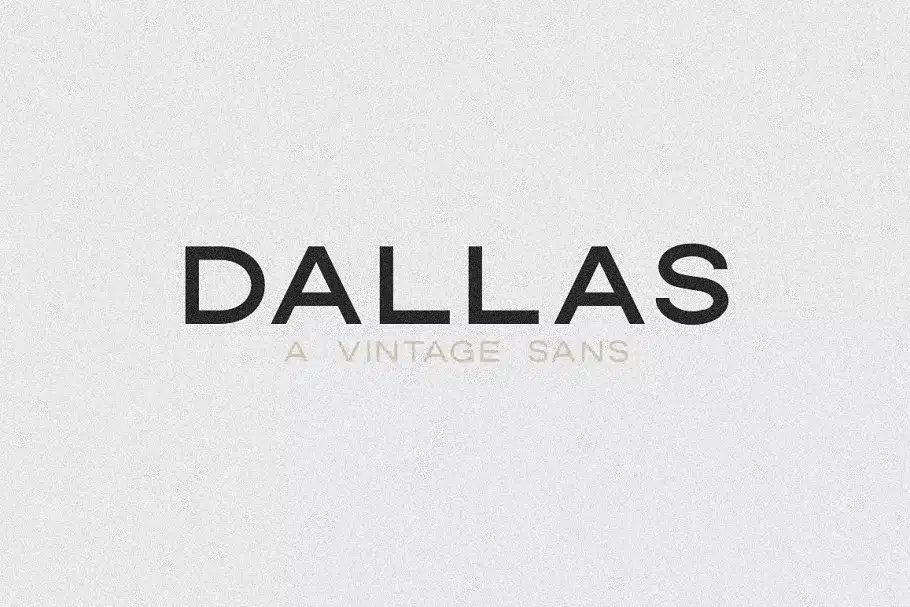
Looking to add a modern vintage flair to your projects? Look no further than Dallas. We’ve fallen in love with its all-caps vintage sans serif design, and we think you will too.
With five different weights/styles to choose from, layering options, foreign language support, and a wide range of characters, Dallas is versatile and accessible for all kinds of projects.
And with a great range of weights, from Light to Outline Thick, it’s perfect for all sizes and contexts.
So, if you want a legible and stylish font for your subtitles and captions, Dallas is definitely worth checking out.
How to Pick a Font for Subtitles
Subtitles are an essential component of any video content, whether it be movies, TV shows, or online videos.
They provide a way for viewers to follow the dialogue and understand the content better.
Choosing the right font for subtitles is crucial, as it can affect the readability and comprehension of the content. Below we will discuss how to pick a font for subtitles.
Consider the Platform
When choosing a font for subtitles, it’s important to consider the platform on which the video will be displayed. Different platforms have different font requirements and limitations.
For example, YouTube recommends using sans-serif fonts, while Netflix requires the use of specific fonts for its subtitles.
Consider the platform’s font guidelines before choosing a font for subtitles.
Font Size
The font size is an essential factor to consider when picking a font for subtitles.
The font should be large enough to read comfortably on any device, but not so large that it takes up too much screen space. It’s essential to strike a balance between readability and screen real estate.
Serif vs. Sans-Serif
Serif fonts have small lines at the ends of letters, while sans-serif fonts do not. Serif fonts are typically considered more traditional and are often used in print media, while sans-serif fonts are modern and commonly used on digital platforms.
When it comes to subtitles, sans-serif fonts are generally easier to read, as the small lines on serif fonts can be difficult to distinguish at smaller font sizes.
Font Color
The color of the font is also an essential consideration when choosing a font for subtitles. The font color should contrast with the background color to ensure readability. Black or white fonts are the most common choices for subtitles, but other colors can be used if they contrast well with the background.
Font Style
The font style is another factor to consider when choosing a font for subtitles. Bold or italicized fonts can be used to emphasize specific words or phrases. However, it’s essential not to overuse these styles, as they can make the subtitles difficult to read.
Language Considerations
Different languages may have different requirements when it comes to subtitle fonts. For example, languages with a lot of accents or diacritical marks may require a font that supports these characters. It’s essential to consider the language requirements when choosing a font for subtitles.
Testing the Font
Before finalizing the font for subtitles, it’s essential to test it in various settings. Try the font on different devices and screen sizes to ensure readability. It’s also a good idea to test the font with a group of viewers to get feedback on its readability and overall look.
Why use closed captions for your videos?
If it isn’t entirely clear yet, accessibility is the primary reason to include subtitles and captions in your videos.
In addition to making it possible for people who are hard of hearing to enjoy your videos, captions can also assist non-native speakers in comprehending the words being used by speakers.
Furthermore, without these captions, you won’t be able to share your video on some platforms that require accessibility regulations.
What’s more, as streaming platforms and film festivals update their terms to require content creators to add captions, you’ll find that these text tools won’t just be a “useful accessory” but will actually be necessary for staying competitive in a growing media market—not to mention inclusive, empathetic, and thoughtful.
Best Fonts for Captions Summary


Best Fonts for Captions Summary
Choosing the right font for subtitles and captions is crucial to enhancing the user experience. The fonts listed in this article are the best options for subtitles and captions in videos.
Using these fonts will help ensure that your subtitles and captions are legible, professional, and easy to read. By implementing these fonts, your video content will stand out and engage your audience better.
What’s your favorite font find from the bunch? Let us know in the comments!


