
Let's Fix All The Bird Logos In Pro Sports
 credits: [object Object]
 There are 12 teams across the Big Four leagues named after birds, and to be honest, it’s a pretty raw deal for the birds. The teams get, for free: an entire graphic identity based around attractive and charismatic wildlife to put on shirts and hats and stuff to sell for a ton of money. The birds, each a marvel of evolution, sculpted into their current forms over millennia by the unceasing struggle to survive and propagate, get: a bunch of their habitat chopped down to build a stadium with public money that could otherwise have gone to conservation, and nothing else.
Adding insult to injury for these innocent birds is the fact that the teams can’t even get their damn colors right.
Birds are constantly being misrepresented in popular culture. Almost every time you see or hear a bird on screen it’s wrong. Birds from other continents are used as stand-ins for our native species. Birds are misidentified, have strange calls attributed to them, or are just plain faked.
Sports are no exception to this misinformation, and are especially egregious because their wide audience means they’re a huge missed opportunity for education. If a fan is going to wear a bird on their hat, we should make sure the bird is depicted accurately, right? Maybe?
But I’m here to change that. I work hard to expose the shortcomings of bird representation in the public eye, and it’s high time for sports logos to get the same treatment. I worked with illustrator Ashley Anderson ( @HiddenStashArt) to fix the birds on each of the pro bird logos, giving these species a little tiny bit of dignity back. Let’s see how it looks.
MLB
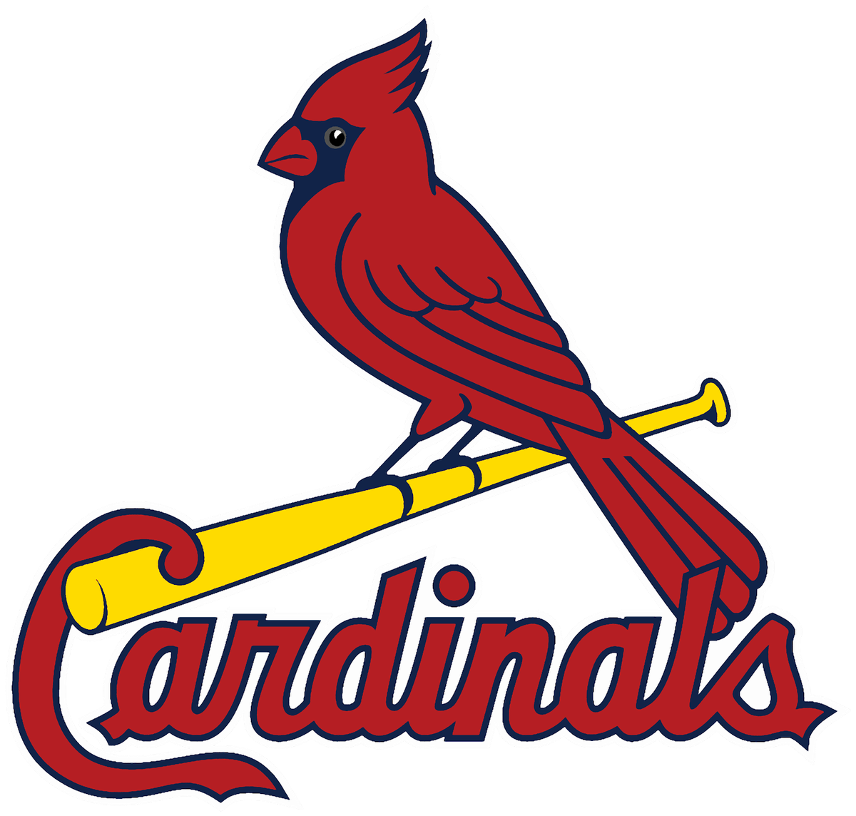
St. Louis Cardinals
Current logo

Fixed logo
 credits: [object Object]
 Nearly everywhere our familiar northern cardinal is represented, it’s represented incorrectly. It’s wrong in company logos, it’s wrong on tchotchkes, it’s wrong on signs welcoming you to states where the northern cardinal is the official state bird, and it’s wrong in tons of sports logos. This bird has human teeth, for chrissake.
But the main problem with how northern cardinals are usually represented isn’t their teeth, it’s their bill. Northern cardinals have red bills. Northern cardinals do not have yellow bills. They don’t. They don’t have yellow bills. None of them. Here are more than 50,000 images of northern cardinals and none of them have yellow bills.
A little Photoshop paint-bucket click to make the bill red and to make the eye black and there you have it: a corrected St. Louis Cardinals logo. That wasn’t so hard, was it?
Toronto Blue Jays
Current logo

Fixed logo
 credits: [object Object]
 Another easy fix. Blue jays have more black on the bill and face than in Toronto’s current logo, and getting rid of the blue throat and darkening the blue on the crest actually makes for a more attractive final product, if you ask me. Plus, the Blue Jays have always tried to shoehorn black into their color scheme, and now they have a good excuse.
Baltimore Orioles
Old logo (until 2018)

Current logo

Fixed pre-2018 logo
 credits: [object Object]
 Fixed current logo
 credits: [object Object]
 The bird on the logo the Orioles used until 2018 was closer to accurate representation than any other bird in pro sports. Only the leg color was off: An oriole’s legs are gray, not orange.
I’ll admit that adding an accurate gray bill and gray eyes to the current cartoony logo is sort of unsettling, like he’s diseased or something, but it does define the bill better and … whatever, he’s a dumb cartoon. Bring the old one back. Also, quick bonus points for the Baltimore Orioles which is the only team name that’s also a full species name.
NFL
Philadelphia Eagles
Current logo

Fixed logo
 credits: [object Object]
 Oh so we’re all apparently cool with our national bird—the symbol of our great and prosperous country—having a silver bill? This nation is falling apart and we’re just sitting here letting it happen. Add a yellow bill and a yellow eye and this bald eagle logo is accurate, it looks better, and it’s not a damn national disgrace.
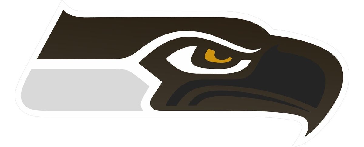
Seattle Seahawks
Current logo

Fixed logo
 credits: [object Object]
 All right, this is getting a little trickier now. First things first: “seahawk” is a colloquial name for the fierce, globe-spanning species of raptor called the osprey, so that’s what we’re basing our updated colors on. But, ornithological accuracy isn’t at all the point of this logo, which instead is done in the artistic style of the tribes of the Pacific Northwest Coast. Ospreys aren’t colorful birds, and so changing the colors of this logo isn’t an improvement in any sense, but here it is anyway.
Baltimore Ravens
Current logo

Fixed logo
 credits: [object Object]
 Purple and white is just a nightmare of a color combination. It doesn’t look any better on corvus corax than it does on camouflage pants. Worse, there’s zero purple or white on a common raven. They’re all black, tip to tail. Ditch the purple and keep the gold, and this becomes an ass-kicker of a logo, just like the bird it depicts.
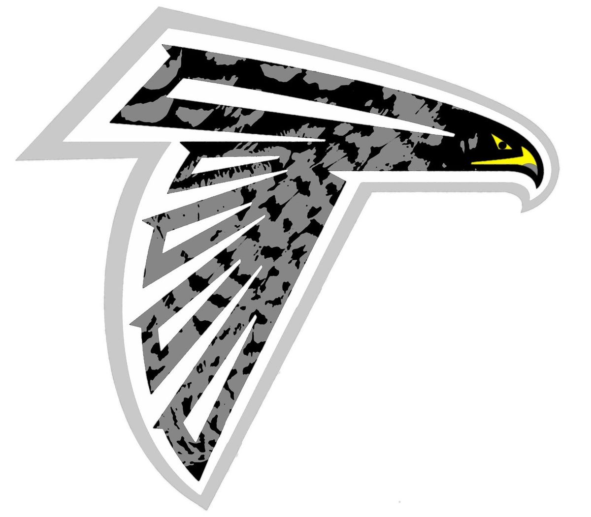
Atlanta Falcons
Current logo

Fixed logo
 credits: [object Object]
 Two of Atlanta’s three pro sports teams are named after birds: the Falcons and the Hawks. (It used to be three out of four, before the NHL’s Thrashers, named after Georgia’s state bird the brown thrasher, moved to Winnipeg). But both the Falcons and the Hawks have generic nonsense logos. The Falcons logo is stylized, I get it, but it doesn’t make a lick of sense (why is its foot sticking out?) and there’s no actual falcon that looks remotely like it.
Three species of falcon can be found in Georgia. Two of those, the American kestrel and the merlin, are fierce and beautiful but small. The third, the peregrine falcon, is bigger, meaner, and is recognized as the fastest animal on earth. Let’s go with the peregrine. The new logo is still stylized, but now includes a yellow beak and eye, and the mottled grays of a Peregrine.
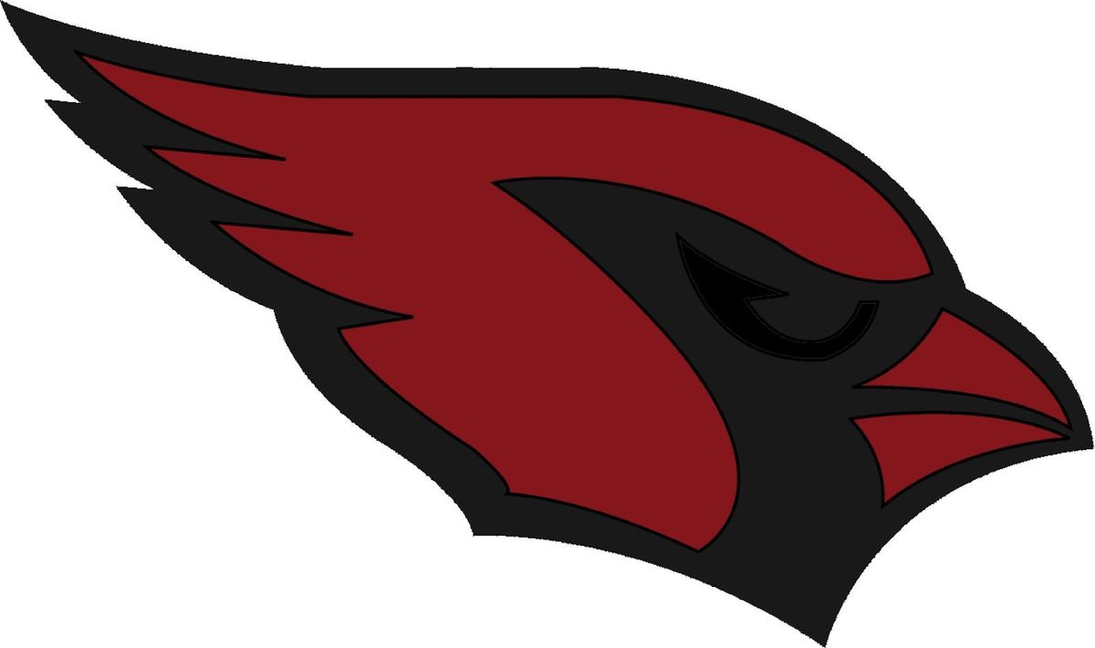
Arizona Cardinals
Current logo

Fixed logo
 credits: [object Object]
 I warned you about the yellow bill. Man that thing is just ugly as hell, in both iterations. Maybe cardinals just aren’t supposed to look scary? Arizona should pick a new team name, because northern cardinals aren’t even all that common there. Honestly, some human teeth would actually be a nice distraction here.
NBA
New Orleans Pelicans
Current logo

Fixed logo
 credits: [object Object]
 Goddamn I love this fixed logo. A lot of people gave New Orleans crap for naming their team after the brown pelican, the state bird of Louisiana, but I’ll defend it to my last breath. Pelicans are huge, not scared of nothin’, and are a fittingly anomalous choice for a proudly atypical city like New Orleans. I think the more accurate brown in the fixed logo is a real improvement, ditching the weird patriotic color scheme and highlighting the city name. Win-win.
Atlanta Hawks
Current logo

Fixed logo
 credits: [object Object]
 Ahhh, what can you really do? This is a beautiful logo, and I’m not gonna go slap a bunch of colors on it to make it less generic. (But if I did it’d be a red-tailed hawk.) We did get rid of that little hitch on the throat, though. What the hell is that thing supposed to be?
NHL
Pittsburgh Penguins
Current logo

Fixed logo
 credits: [object Object]
 It’s an actual penguin now! An emperor penguin! Emperors are the biggest penguins on earth (eat it, king penguin), making it a worthy mascot for a bunch of tough ice guys. Better, this logo honors the beloved triangle logo used from 1993–2002.
Anaheim Ducks
Current logo

Old logo that actually sort of shows a bird

Fixed logo
 credits: [object Object]
 The current logo is one of the worst things I’ve ever seen. What even is that, a webbed foot? You used a foot, because it can kind of look like a “D,” for “duck”? Just show a duck! We went back to the earlier logo for this project, the one from the movie, with the sticks and the goalie mask. Then we made it into a real bird. You get the deal by now.
There aren’t a whole ton of ducks in Anaheim, to be honest. We landed on the ring-necked duck because it’s kinda cool-looking (even though it’s famous for being poorly named: the ring on its neck is nearly invisible unless you’re holding one after just having shot it) and lives nearby. The final logo is a little messy, though it does give the team a better identity than the weird goalie mask mummy bird.
This wasn’t so hard, was it? Some of these logos are straight-up better than the current ones. Fixing these logos is easy, and gives some birds just a tiny nugget of respect back after we’ve taken so so much from them. You’re next, mammals.
Nick Lund ( @TheBirdist) writes about birds and birding for Maine Audubon, the National Audubon Society, Slate, The Guardian, and others.